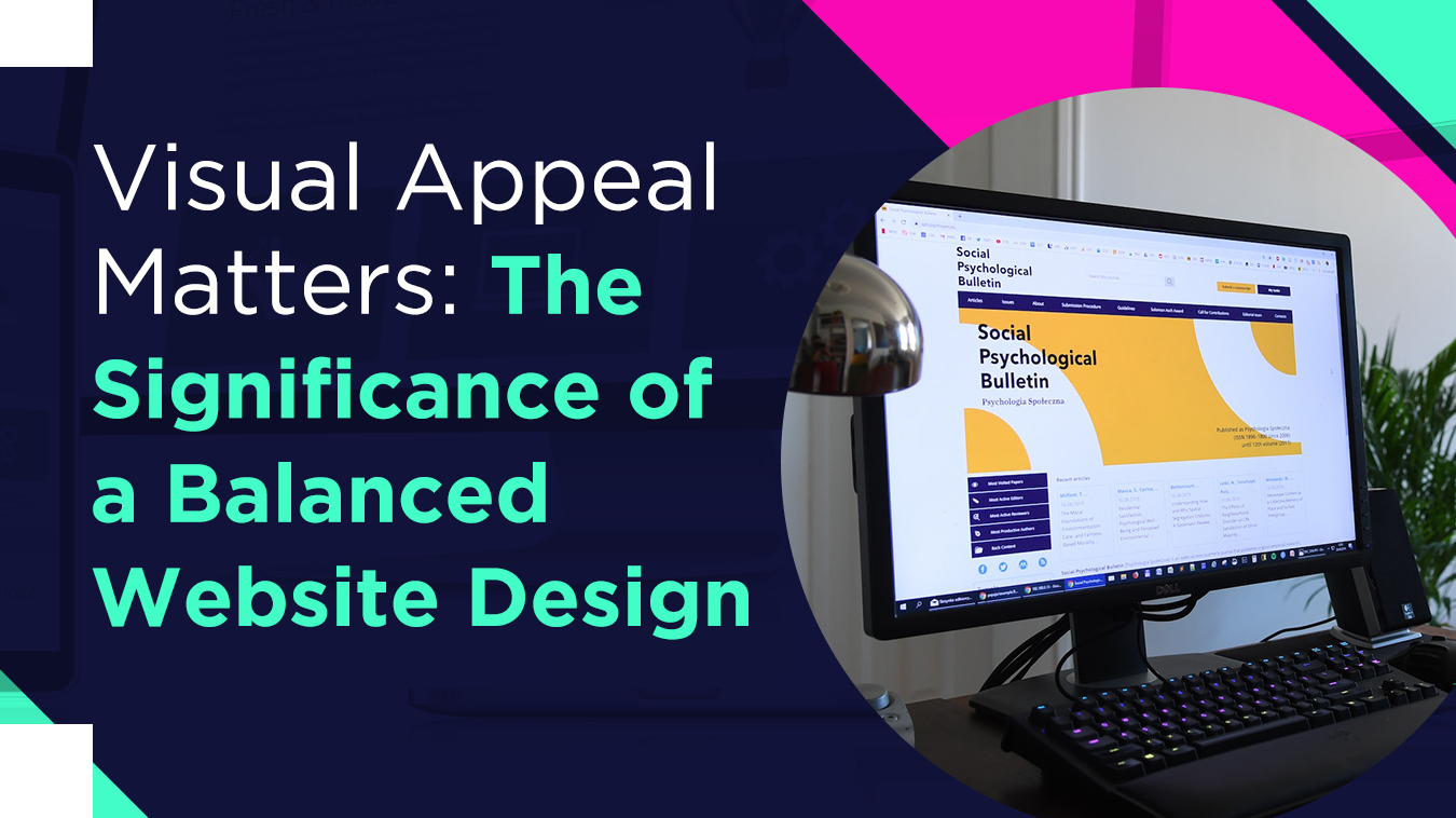
Responsive design is quickly becoming the standard for website design and development. By designing a website to respond to different screen sizes and devices, you can ensure that your website looks great regardless of what device your users view. In this blog, we'll explore the benefits of responsive design and why you should switch to a responsive website design.
What Is Responsive Web Design?
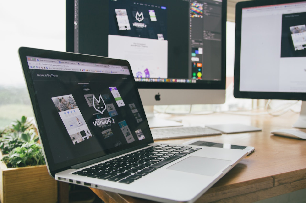
Responsive web design (RWD) is an approach to web design that makes web pages render well on various devices and window or screen sizes. By using a combination of flexible grids, layouts, images, and intelligent use of CSS media queries, a website can be designed to provide an optimal viewing experience—easy reading and navigation with a minimum of resizing, panning, and scrolling—across a wide range of devices (from desktop computer monitors to mobile phones).
1. Improved User Experience
Responsive website design improves the user experience of a website by making it easier to navigate and access the content. Instead of pinching and zooming to view the content, users can access the website on any device without any issues. This makes it easier for them to find what they need and create a more enjoyable experience. Additionally, a responsive website design ensures that the website looks great on any device, which can lead to more conversions and user engagement.
2. Improved SEO
Another benefit of a responsive website design is improved SEO. Google has stated that responsive design is their recommended design pattern, allowing them to crawl, index, and serve content for mobile devices more efficiently. Additionally, having a single URL for your website makes it easier for search engine crawlers to index your website and serve it to users.
3. Save Time and Money
Rather than managing two distinct websites, one for desktop and one for mobile users, a responsive website design allows you to use a single website that automatically adjusts to the device used. This means that the same website can be used, regardless of whether someone is visiting the website on their laptop, tablet, or smartphone, which can save a lot of time and money in the long run.
4. Increased Mobile Traffic
As the number of people accessing the internet from mobile devices continues to rise, it is essential for businesses to have websites that are optimized for mobile devices. Responsive design allows companies to reach desktop and mobile users and capitalize on the ever-increasing mobile market.
5. Enhanced Brand Reputation
Responsive design allows businesses to create a more positive impression with their customers by showing that they are using the most up-to-date web technologies. This helps garner trust and loyalty, as customers will feel confident that their needs are being met and their expectations exceeded.
Conclusion
As you can see, switching to a responsive website design has many benefits. From improved user experience and SEO to time and cost savings, responsive design is quickly becoming the standard in website design and development. Now is the perfect time if you still need to make the switch.
If you have a business and are looking for website designers in Tampa, SPYCE Media can provide you with white-label digital marketing services. We are experienced in optimizing search engine results and using email and social media marketing to increase your reach.


SHARE